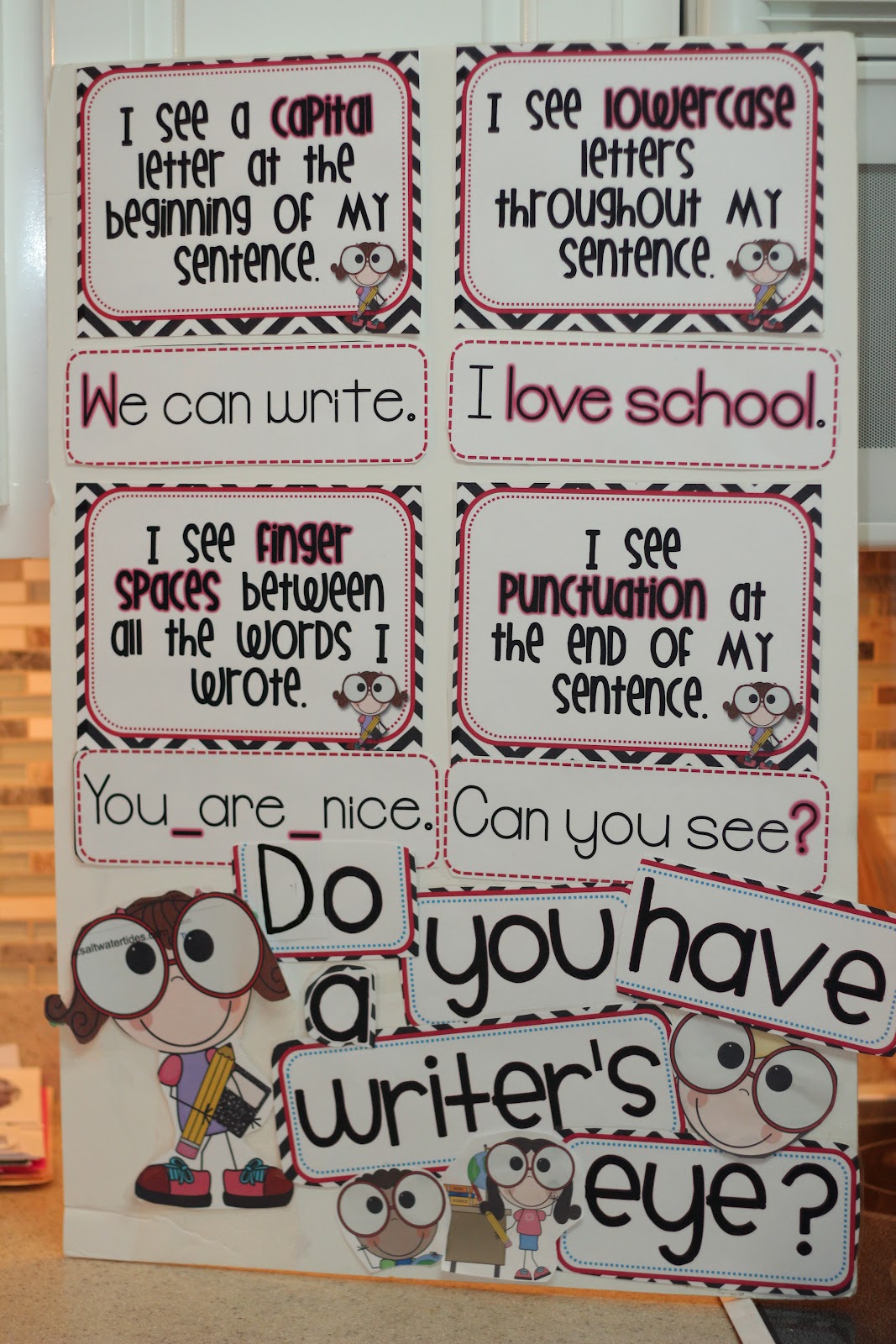
I'm really starting to love Mondays! What are we going to do when school starts? Someone is going to have to think of something really fun. Thank you
Tara for hosting one of my favorite linky parties. Today I'm going to share with you The Writer's Eye project. I first found this little idea from Mrs. Phippen right
here! Well, I made one to match my colors. I also used Cara's posters to make one for my intern. To get a black and white polka dot version for free click
here. There are two different styles- one with bees and one with little children. There is also a free set with the
font Comic Sans in case you are a real stickler for fonts.
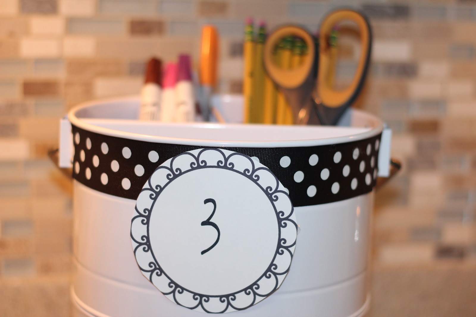
I also fancied up my white pencil buckets from Target. I added some ribbon and the table number. I'm still debating on which label I like better. I have an idea but want your opinion.
Say 1 or 2! Leave me a comment and I'll pick three winners to win a packet from my tpt store. Don't forget your email!
 |
| label #1 |
 |
| label #2 |

Now I'm off to check out all of the other wonderful creations. I know there are TONS!


I like them both but #2 is my favorite. So cute
ReplyDeleteTerri
thefirstgradeprincess.blogspot.com
princessleigh1st@yahoo.com
I think I prefer #2. In Queensland Handwriting style, #1 resembles the letter 'z'. Just love your "Writer's Eye" posters...
ReplyDeleteI heart 1! I love bows!!!! I need that font and design! Where's it from? I was thinking the same thing about making things! We're goin to panic once we go back to work!
ReplyDeleteMegan
www.mrswheelerfirst.blogspot.com
meganwherler44@yahoo.com
Oh I love them both too, but I really like #1 better-
ReplyDeletekellybrown28021@gmail.com
I love them both too, but I like 1 the best! Send some of your mojo my way....loving what your doing:) Mine is not crafty but cleaning, now I need to craft! luvzenkm2 at gmail dot com :)
ReplyDeleteI think their both cute but if I had to choose it would be #2. Thanks for the freebie.
ReplyDeleteI like number 2 better!! Love the posters too---maybe I need to do that today!
ReplyDeletesunburst541@gmail.com
Both buckets are super cute, but there is something about #2 that really draws my eye.
ReplyDelete-Megan
First Grade Magic
Label #1 is my fav- just darling! :) Congrats on being so productive!
ReplyDeleteKimberly
The Learning Tree
Your projects turned out great!
ReplyDeleteJennifer
kindertrips
They both look so pretty but my favorite is #1. I think the bow goes well with the polka dots. They are very fancy. I want some!
ReplyDelete~Andi
That was a great wasto jazz up a plain white bucket! I like label # 2 best!
ReplyDeleteI love yours little bucket.
ReplyDeleteWho designed your blog ????
I love it!
Tiffany from Dreams Do Come True @
http://happilyeverafter-tiffany.blogspot.com/
They are both cute, but my favorite is #1. The wrting posters are fabulous! Thanks for sharing them. They will look great in my new writing center. AND gotta love those polka dots :)
ReplyDeleteKrista
stellar-students
Super cute!! I like #2 the best. Thanks for sharing!
ReplyDeleteShannon
Sweet n Sassy in 2nd
i like number 1 the best!
ReplyDeleteJrlaskows@gmail.com
I pick #1. It looks like the Digs My Hart font which is one of my FAVORITES! But #2 is just as cute. The Writer's Eye is super cute too. Your intern is very blessed to have such a creative teacher to learn from.
ReplyDeleteKristi
Learning's a Hoot
I love #1!!!! They both are so cute though! Thanks for sharing!
ReplyDelete~Jessica
Fabulous and Fun 4th Graders
I like 2, but they are both cute. Your poster turned out great. Thanks for sharing.
ReplyDeleteJill
Bubbalulu.blogspot.com
If something has a bow on it, I'm going to pick it!
ReplyDeleteSo, number 1!
Halle
Across the Hall in 2nd
Label 1 is my favorite ! The writing posters look great !
ReplyDeleteLindsey - lmburto@gmail.com
Both labels are cute, but I vote #2!
ReplyDeleteI'm loving label 1. They are both super cute but I like the way #1 fits on the holder.
ReplyDeleteLabel #2
ReplyDeleteModern Kindergarten
I like number 1 better. It is different from what you usually see!
ReplyDeleteStephany
primarypossibilities.blogspot.com
Wow! What super cute ideas! I love number 1! By the way, I am a new follower. I would love to have you visit me and link up on my "Blogs of Inspiration" page.
ReplyDeleteHappy Teaching,
Laura
TIPS: Teach, Inspire, and Prepare Students
I really like #1...and I am not usually a bow kind of girl! But it looks great on the label and centers the number perfectly.
ReplyDeletetokyoshoes (at) hotmail (dot) com
I like label 2 better. Both look great, though!
ReplyDeleteTracey
Third Grade All Stars
Love your writer's eye poster! I know! What are we going to do without this linky during the year?!
ReplyDeleteNicole
Rowdy in Room 300
Come check out my awesome giveaway HERE!
It's a toss up! Love them both, but I'm going to vote for #1. Thanks for the Writer's Eye posters. I'm excited to use them this year!
ReplyDeleteTaryn.Ryan@fairfieldsfuture.org
I like the simplicity of number 2 better! Great job! I love it.
ReplyDeleteSarah
Miss A's Kindergarten
missaskindergarten@gmail.com
Love them both but there is something very sweet and homey about #1. Thanks for sharing!
ReplyDeletesanfordb@issaquah.wednet.edu
#2 is my fave!
ReplyDeleteI like #1, but you can't go wrong wither way! So cute!
ReplyDelete#2 is my favorite but both of them are really cute.
ReplyDeleteRose
"The Wonderful World of Kindergarten"
Thank you for the darling Freebie... My classroom is bees so the bee onw will be PERFECT!! I just printed it off.
ReplyDeleteஐRikki
The Hive
Oh and I like #1
ReplyDeleterikkileeusu@yahoo.com
I love both of them. I like #2 the best.
ReplyDeleteyvonnee
yvonneeyrg@gmail.com
For kids, I like #2 the best!
ReplyDeleteKristin :)
kristinbrehm@gmail.com
I like number 1, but I think it could be confused for a z.
ReplyDelete~April
The Idea Backpack
ideabackpack@gmail.com
Do I have to pick just one? I like #2, no wait...I like #1. I'm changing my mind back to #2. Sorry - love them both!
ReplyDeleteThanks for the Writer's Eye freebie. I really needed it!
Hooty's Homeroom
They are both cute, but I think #2 is the better choice. I never think to embellish purchases. Thanks for the inspiration!
ReplyDeleteI like #1 but with the font of #2. Either way, they look really nice and I like the added ribbon. It is the perfect finishing touch.
ReplyDeleteCatherine
Kinder Cuties
jcrcis at yahoo dot com
I can definitely switch fonts. Thanks for all the suggestions. I like them both but leaning towards one over the other.
ReplyDeleteI like #2 the best. Thanks for the freebie!
ReplyDeleteI am in the #2 camp.
ReplyDeleteHeather
room 4 imagination
I love #2!
ReplyDeleteMisty
Think, Wonder, & Teach
love #2
ReplyDeleteMarianne
mabteacher1@gmail.com
I like #2 also, since the 3 is more standard looking, but fun. Love your Writer's Eye idea too! I'm completely revamping my writing center this and love this! Thanks for sharing!
ReplyDeleteCathy :)
cisforcookiesclasscrafts.blogspot.com
Cute! I like #1!!!!
ReplyDeletekkish1110@gmail.com
I love seeing all the projects you're getting completed!! I prefer label #2. I think it would be easier for the kiddos to read too. Both are cute though!
ReplyDeleteKaryn
Kideducator@comcast.net
I like 2! P.S.- Good for you for getting so much accomplished this summer! I've been a little lazy.. it's funny-- yesterday I decided I needed to get with it. Nothing like waiting until summer is almost over.. haha!
ReplyDeleteI think I like #1 too... but maybe with #2 font. The curl in the three is adorable.. but I think something simpler would be better. They look amazing!
ReplyDeleteAmanda
redseventeen@gmail.com
Reaching for the TOP!
I like Label #1! It is "fancier"
ReplyDeleteVallampkin@yahoo.com
Thanks for sharing your freebies! They are awesome!
ReplyDeleteI really like both labels, but I like #1 a little better...I think the bow goes good with the ribbon you have going around the can.
~Sara~
Ramblings of a Deaf Ed Teacher's Mind...
saraannmiller@gmail.com
I like both of the labels, but would combine them if possible- I love the bow from #1 and the number from #2.
ReplyDeleteGood luck with whichever choice you make.
Shar W.
jandcangelscents@sbcglobal.net
Both are cute! I like # 2 better.
ReplyDeleteRie
Hiphophurrayreading@gmail.com
I like both but I like #2 better.
ReplyDeleteLorena
Little Treasures
lorena.delgadillo@gmail.com
I like number 1 the best. Cute!
ReplyDeleteKaren
kltcarley@gmail.com
I like number 1 the best. Cute!
ReplyDeleteKaren
kltcarley@gmail.com
I like number 1 the best. Cute!
ReplyDeleteKaren
kltcarley@gmail.com
I love your writer's eyes posters!!! I think I'm going to have to go with label #1. :)
ReplyDeleteLisa
Learning Is Something to Treasure
fsuteach81@yahoo.com
I love number 1! The bow is so cute!
ReplyDeleteKayla
I like #2. afuller@dentonisd.org
ReplyDeleteI like #2 better but I like where #1 is placed better. :)
ReplyDeleteaaparsons@hotmail.com
Thanks for all the suggestions. Announcing the winners on Tuesday.
ReplyDeleteLabel #1 is my favorite...it immediately caught my eye over #2! Great ideas! :-) Becky
ReplyDeleteI like #2 ... #1 looks too close the cursive "z" that it could confuse students just learning cursive. But both designs are very cute!
ReplyDeleteI like #2 better. It's more simple and kids won't be confused if it is a letter or number.
ReplyDeletedianancastro@yahoo.com
I love your writer's eye project! Personally, I like label #2 better!
ReplyDeleteJackie
Third Grade's A Charm
I'm digging your sentence writing eyes posters! I was wondering if you would be able to change the color background from black to red. My color theme is red and white (baseball stuff). The second set without the bees is the one I'm interested in. Thank you! teachum97@hotmail.com
ReplyDelete#1
ReplyDeleteI love the labels! I would pivot #1 because the bow adds pizazz!
ReplyDeletelynnetoups@gmail.com
I love #2! Awesome!
ReplyDeleteI love the "Writer's Eye" boards!!
ReplyDelete❤Teri
A Cupcake for the Teacher
I love #1!
ReplyDeleteErica
Sprinkles to Kindergarten
erica_crowder0612@yahoo.com
I'm liking number 2 also although they are both super cute!! I love the Writer's Eyes posters...I have the set on the right for my room (or a similar version) I am glad you are enjoying this linky...I am going to try to keep it going as long as I can...I know we all start school at different times.....my start date is right around the corner. Thanks for linking up:)
ReplyDelete4th Grade Frolics
I think #2 will be easier for students to read the numbers. BTW I love your posters and will be adding them to my classroom this year!
ReplyDeleteMrs. Jankord
ajankord@gmail.com
jankordians.com/blogspot
This comment has been removed by the author.
ReplyDeleteBoth are cute, but I like 2 better!
ReplyDeletejms0101@hotmail.com
cre8thelife.blogspot.com
I like Number 1. However, if it's for a student group then I would use #2 because boys don't usually like bows.
ReplyDelete